Click here for explanations of the Chaikin Analytics Buy and Sell signals
Quantitative investment models have typically been evaluated using the protocols of academic research; the “universe” of stocks is divided into a certain number of groups, or buckets (or in academic parlance, “quantiles”) and the performance of each bucket is noted. The ideal outcome is one in which the bucket containing the “best” stocks (let’s call it Bucket 1) experiences the strongest performance. Stocks in Bucket 2 show the second-highest performance, Bucket 3 stocks come in third and so on down to the lowest-ranked bucket containing stocks that perform worst.
However valid the academic approach is, the reality if that models rarely if ever achieve ideal results when used in the real world. So investors are often left to judge the extent to which they willing to accept deviations from the ideal.
- Beyond the usual and ever-present challenges in crossing the logical bridge that separates past performance from future outcomes, there’s also the challenge of variability within each bucket. The average performance within a bucket is just that — an average. It’s possible, though, that Bucket 2 could indeed turn out to be the second-best performing bucket — on average —but still have a substantial number of stocks that outperform even the better stocks in bucket 1 and a meaningful number whose performance is below the average of, say, bucket 5.
- This poses great challenges to the typical investor, who rarely if ever is simply going to buy all the stocks in any particular bucket which, in a large ranking universe such as the one we use, would consist of several hundred stocks. How can the investor get a sense of the merits of say, the three or four being examined today. What is the probability that all, despite being in the top-performing — on average —rank bucket, are, individually, mired near the bottom of the universe.
There is no perfect way to evaluate model performance. One could — and some do — further study of bucket composition, but as long as one is confined to the world of backtesting, such efforts tend to be unproductive at best and potentially dangerous given the temptation to “solve for” the detailed variations of what one observes, a disreputable practice known to quants as “data mining,” “over-optimization,” or “curve fitting.”
We’ll be focusing on a practitioner-oriented Top-minus-Bottom (“T-B”) approach. Rather than getting lost in the weeds of a large number of bucket averages and variabilities within buckets. This is consistent with the approach taken by many practitioners who, acting in accordance with the Carveth Read (a 19th century British logician) mantra to the effect that “it is better to be vaguely right than exactly wrong,” simply compare the best ranked stocks to those with the worst ranks. Our presentation will also work with measures used by many contemporary traders, hit ratios, and effective maximum drawdowns.
Step one for us is to define a relevant question: Is an investor better off choosing from a stock suggested by the model, as opposed to something else (i.e., a stock that did not generate a model-based bullish signal). This, in essence, is a two-bucket ranking system; Bucket 1, the Top bucket, consists of stocks ranked Very Bullish or Bullish while Bucket 2 consists of all other stocks.
Our performance tables will show, for the entire 2012-through mid-2020 time frame, for each individual year from 2012 through 2019, and for the first half of 2020, the following information:
- T-B Avg.: This is the average holding-period return for the Top bucket (favorably ranked stocks) minus the average return for the Bottom bucket (all neutral and unfavorably ranked stocks). NOTE: We are not showing raw returns. We are showing excess return or Top-minus-Bottom. That means we should prefer positive numbers here regardless of market conditions.
- Hits and Misses (# and %): A “hit” means the Top (favorably-ranked) bucket outperformed the Bottom (neutral and unfavorably ranked) group. Put another way, A hit means that T-B Avg. is a positive number.
- Avg. Hit/Avg. Miss: Average Hit looks only at holding periods in which T-B was a positive number and averages these. Average Miss is the Average T-B for holding periods in which T-B was negative.
- Best Hit/Worst Miss: Best Hit looks only at holding periods in which T-B was a positive number and returns the highest among these T-B tallies. Worst Miss (analogous to Maximum Drawdown) is the Worst T-B tally for holding periods in which T-B was negative.
Results will be computed and shown for three different assumed holding periods; 1 week, 4 weeks, and 13 weeks.
These are “rolling tests,” which means each holding period measures a completely self-contained period in which a hypothetical (equally weighted) portfolio is formed at the start of the period, and then terminated (liquidated) at the end. This helps us avoid possible oddities based on when hypothetical portfolios would need to be constituted. To see how this works, consider a rolling test of a four-week period. Assume, too, that the test period starts on 1/6/20 (the first Monday in January).
- In a conventional portfolio-simulation type of test, the hypothetical portfolio would be put together and launched on 1/6/20. It would run for four weeks, until 2/3/30 at which time the model would be refreshed and re-run for another four week, this time until 3/2/20 at which time the portfolio would again be refreshed and run for four weeks, etc., etc., etc.
- That’s all well and good, but suppose we started the test on 1/13/20 and refreshed on 2/10/20, 3/9/20, etc. Would it have made a difference if we had used one four week cycle or the other? I’ve run many tests over many years, and you’d be amazed at how often the answer turns out to be “yes.” We address this through use of rolling tests.
- A rolling test starting on 1/6/20 would run also run through 2/3/20 but the difference here is that the portfolio terminates and the 4-week performance is added to the tally. Meanwhile, a completely separate four-week test began running on 1/13/20 and will terminate on 3/10/20. Another self-contained four-week test would start on 1/20/20 and terminate on 2/17/20 (in real life, this is a holiday, but let’s keep things simple for now). We’ll start another self-contained fur week test on 1/27/20, and then, another one on 2/3/20.
- Notice that both tests measure four-week performance for periods starting on 1/6/20 and 2/3/20. The rolling test, however allows us to also examine three additional test-portfolios beginning on each of the three weeks between 1/6/20 and 2/3/20.
The Results
For each of the six Buy Signals, the performance data will be presented in three sets of tables each set addressing an assumed rolling holding period consisting of 1 week, 4 weeks or 13 weeks.
Leading Off With A Simple Summary
These tables will contain many numbers, so information overload is a concern. There’s no way to get around the reality that model testing for use in the real-money markets is a challenging task and simplicity, however tempting and appealing it might seem, can lead too easily to misunderstanding and ineffective use.
I did, however, create a set of Summary Efficacy Scores to help keep everything in context. These are expressed as percentages (higher is better) and are presented in Table 1.
The main numeric presentations, are in Tables 2 through 7. Details of the Summary Efficacy Scores are presented below in the Appendix.
Table 1
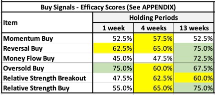
Even though you haven’t seen the details of what everything in Table 1 represents, you can already get a sense of what’s to come.
- As a whole the collection of six Buy Signals are effective.
- The signals are lest effective for quick in-and-our one-week trading.
- All signals except Money Flow Buy have shown effectiveness when 4-week holding periods are assumed.
- The signals are, as a whole, at their best when we think in terms of 13-week holding periods. That said, Momentum Buy is slightly better when four-week hold periods are assumed.
As noted above, you can, if you wish, learn more about the efficacy scores in the Appendix below. But for now, let’s look at the detailed presentations upon which those scores were based.
The Details
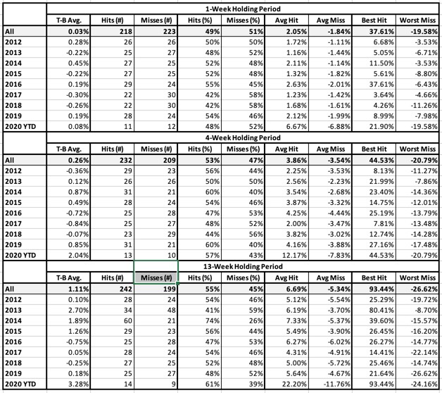
Tables 2 through 7 will present data for each Buy signal assuming, for each, 1- 4- and 13-week holding periods. Top refers to the group of stocks that trigger signals, bottom refers to all others. Our hope is to see Top Bucket returns exceed Bottom bucket returns.
Table 2: Momentum Buy Signal
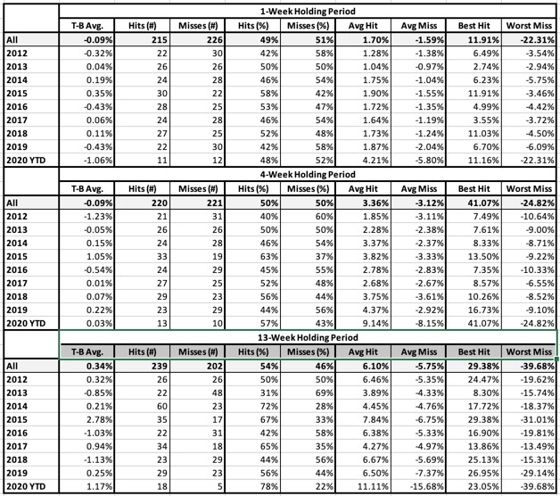
Table 3: Reversal Buy Signal
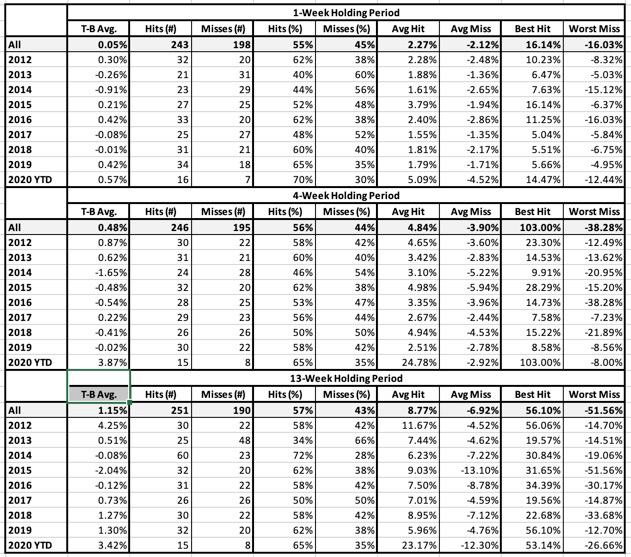
Table 4: Money Flow Buy Signal
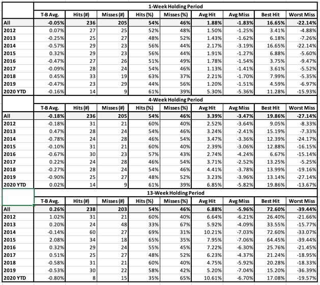
Table 5: Oversold Buy Signal
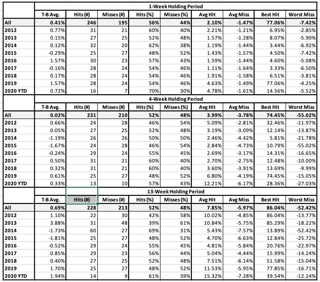
Table 6: Relative Strength Breakout Buy Signal
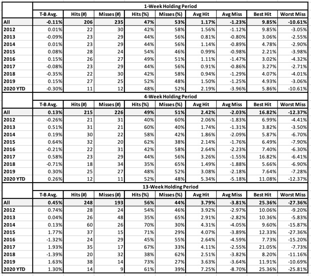
Table 7: Relative Strength Buy Signal
APPENDIX – Computing The Summary Efficacy Scores
The entries in Tables 1-9 were scored using the following criteria:
- If the T-B Avg. figure is positive, score 1; otherwise, score 0.
- If the Hit rate is above 50%, score 1; otherwise score 0
- If the Average T-B for the Hits exceeds the Absolute Value of the average T-B for the Misses, score 1; otherwise, score 0
- If the Best T-B for the Hits exceeds the Absolute Value of the Worst T-B for the Misses, score 1; otherwise, score 0
This produces a set of 40 scores, each of which is 1 or 0 (four items for each of 10 periods). The summary score for the efficacy of the rank is the percent of scores that equal 1. So, for example, if 22 items are scored 1 and 18 items scored 0, the efficacy score would be 55% (22 divided by 40).
The foregoing assumes each of the 40 scores is assumed to be equally important.
